
Hi I'm Chris!
My mantra is:
"Intentional, pleasurable, product experiences are informed by a user's experience and journey."
Links For Time Pressed, Potential Employers
- A link to my resume.
- A Google search link of the name I actually use online (lihimsidhe).
- Links to my social media.
What Is a User Journey and User Experience?
Remember a time where despite how gorgeous or poor an interface was, you had trouble getting to where you wanted to be. It could be navigating a website, a video game, an app, tax forms, or even a hospital. The process by which a user navigates a given system is called a user journey.
User experience (ux) is a deep understanding of users, what they need, what they value, their abilities, and also their limitations. It also takes into account the business goals and objectives of the group managing a product.
What I Do
I create user interfaces by establishing a deep understanding of a users' journey and ux. I do this via a 4 step Build-Measure-Learn-Repeat cycle:
- Build. I clearly identify a product's business and conceptual goals and create mockups represenative of the final product.
- Measure. I take the mockups I've built and test them in the wild with actual users. I record their user journey and ux with as much detail as possible.
- Learn. I deliver the collected data to the client and based on both the collected data and the product's goals, make new mockups.
- Repeat. I repeat the previous steps as many times as the scope of the project allows while also allowing ample time to submit a final product within deadline.
I've found the above process works wonders for rapid development by clearly identifying objectives, iterating upon actual user needs, and design conflicts are a LOT easier resolved by having actionable metrics guide decisions. If you would be interested in hiring me to do these things for you please contact me via email, mobile, or social media:
Overview
I had the incredible opportunity to manage a team of developers and designers to redesign Drexel University's digital rental service that students used to rent equipment. The service had to meet the needs of students, the staff that used it, and the administrators that maintained it. Additionally it had to work the same on desktop and mobile devices.
User Personas
Perhaps the most useful skill I learned during this project was developing user personas. They help answer two very critical questions: 1. Who will be using the product? 2. What needs will they have that the product can solve? I can not stress how useful personas are in streamlining a product's development.
Wireframes
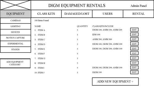
Utilizing the personas that incorporated actual interviews with targeted users and data driven research, we then constructed wireframes that sought to meet user's demmands in regards to our service.
Style Tyle
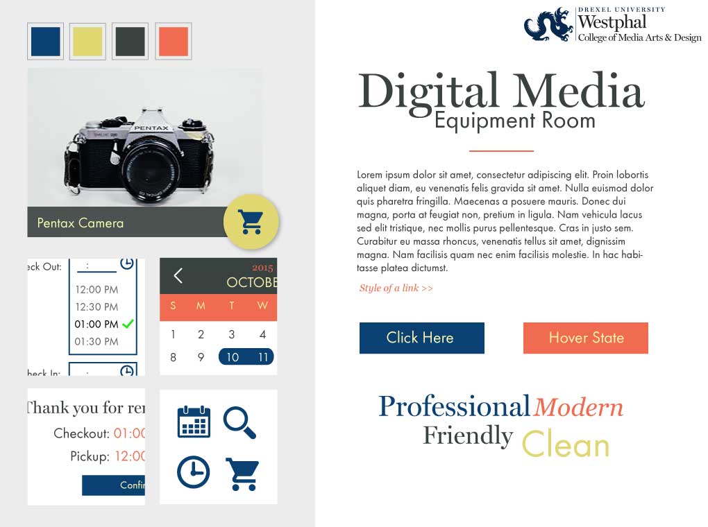
Like a painter adding color to a grisaille underpainting, we added color, texture, and style to our austere wireframe prototypes. By having data on wireframe performance we were able to accurately determine when stylsitic choices are augmenting or detracing away from functionality.
User Testing
Where applicable we user tested every stage of a product's development. Data and results drove our design and development more than our opinion. In a team setting involving a complicated product, user testing was absolutely pricless.
Where Can I See the End Product?
A direct link is here. However, Drexel's Digital Media department mandated that the rental service only be accessible via an intranet. Contact information for staff that have access to the service can be provided upon request. Don't ask me why they never decided to put up a more attractive 'not availible' page. We did make it!
Back to Top

Overview
I had the pleasure to design an ad for a nationally recognized fitness brand; Planet Fitness. Below I detail the process I used to create the ad in question.
Client Instructions
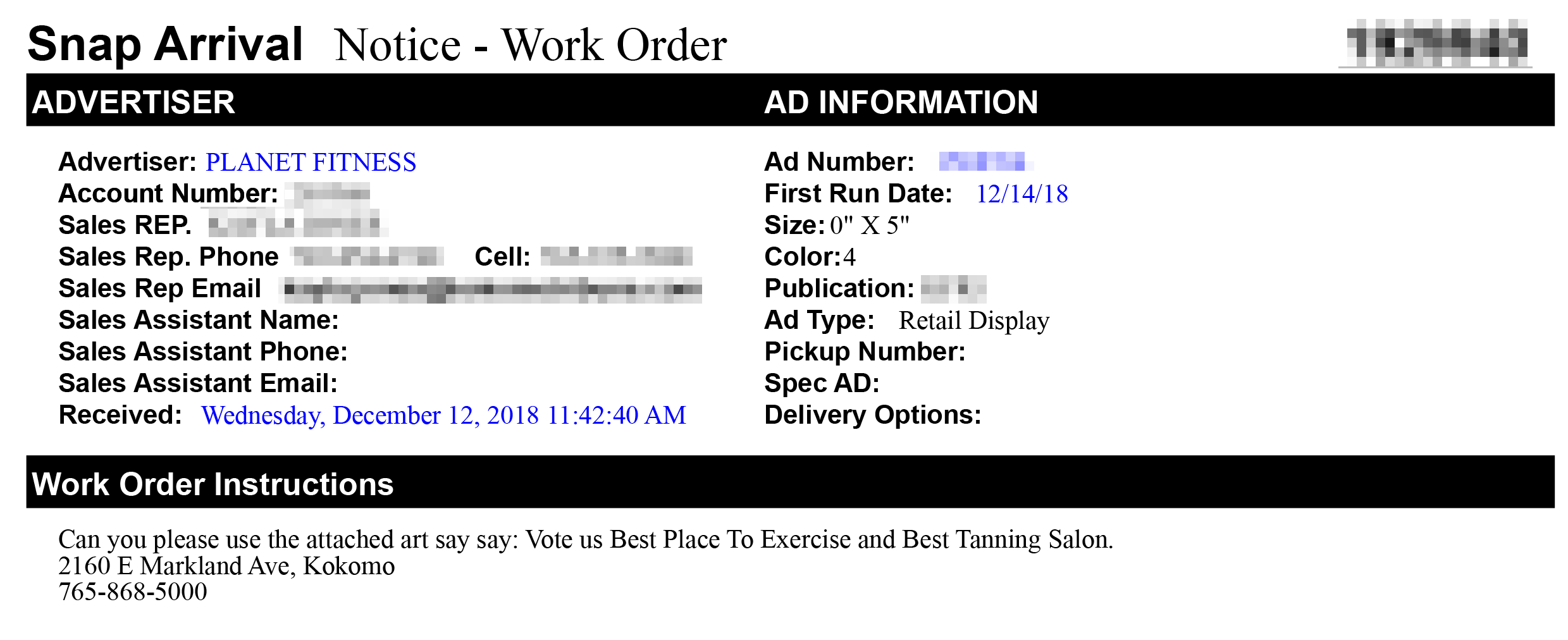
The client's instructions were provided to us production artists in the form of tickets. Generally speaking if the client didn't specifically address a given design element, it was up to the artist's discretion. In this case the only things the client did detail was the text to include. Anything else was my call.
Simple and On Brand
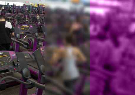
It's always a delight to work for a client that has a strong brand identity. It reigns in what is otherwise boundless creativity. My first stop was to to Planet Fitness's webiste where I discovered their press kit. Since I didn't have access to any imagery of the specific gym in question this was the next best thing.
I knew I wanted the background to be that of a Planet Fitness gym. However, it had to emphasize the text and brand; not compete with it. To address this I applied a gaussian blur and then changed the layer properties to the 'color' blending mode using Planet Fitness's signature purple.
All that was left was to ensure the client request text conformed to the font used by Planet Fitness and it was a wrap!
Back to Top
Overview
Lightmare was a cross device, cooperative multiplayer, action sidescroller, Unity3D game I worked on with at team of 16 other students. The cooperative multiplayer part required that one player be running the game on his/her desktop computer and an other player be running the game on their mobile device.
The desktop player's role was that of combat; it was his/her role to destroy enemies in combat. The mobile player, supported the desktop player by dragging shadows underneath the desktop player to strengthen her and/or underneath enemies to weaken them.
Project Management
My most used skill by far was my background in logistics I acquired in the U.S. Army as a logistics operator. I put this to use as my team's project manager. Our team was a cross college team comprised of students from two differenct colleges: Westphal College of Media Arts and Design and College of Computing and Infomatics. Keeping 5 other designers, 5 computer science programmers, and 5 musicians with vastly different temperments within scope, communicating, and on deadline was definitely a challenge at times.
The tools I used to manage all the tasks required to bring a game from concept to completion were the scrum and gantt methodologies, Slack for team side communications, and the Trello platform to house all tasks, identify who was responsible for them, and to link to all game assets.
This pipeline document details how I was able to bring all these things together.
Game Mechanic Design
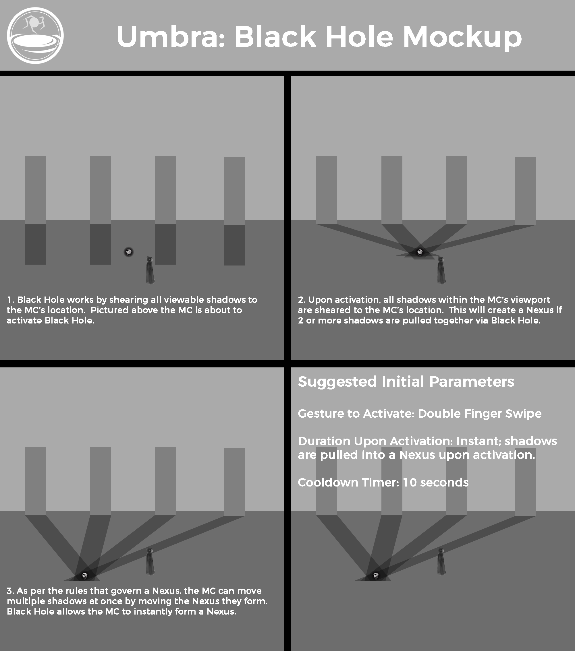
Game mechanic design was a collobarative process between designers and developers. My role in this process was most often the deciding vote on what direction to take for a given mechanic and to maintain our game design document. I also was in charge of designing the special abilities of the players called Umbrae.
Narrative Design
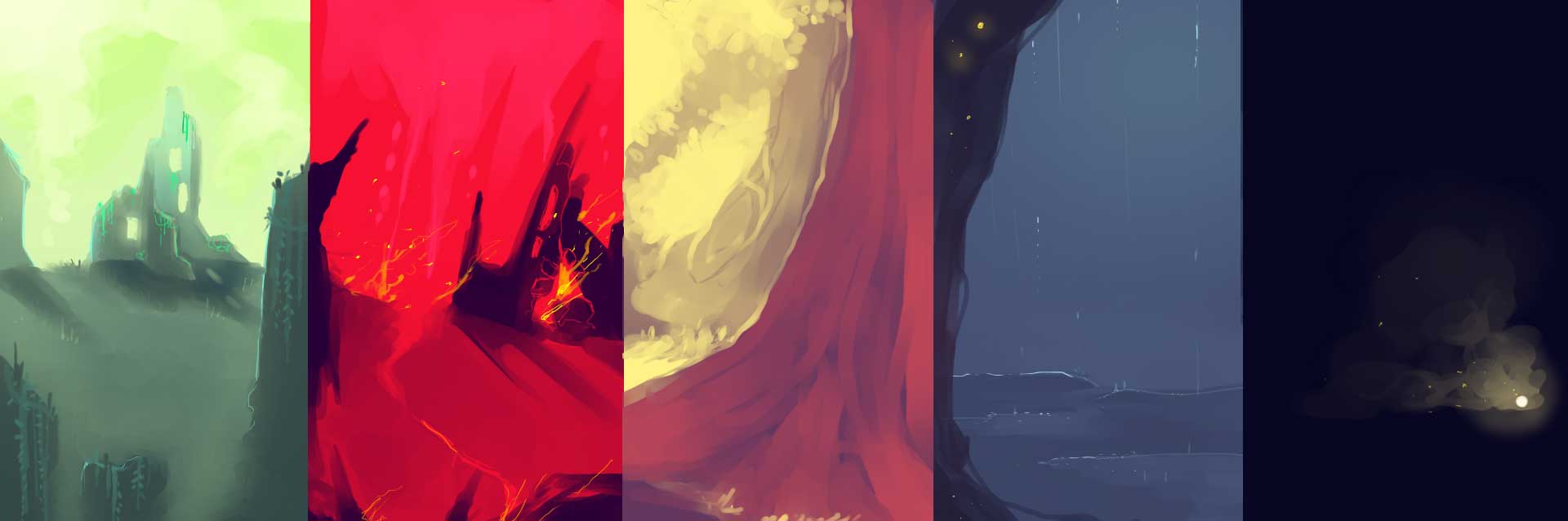
I laid the groundwork for the game's setting and story which included the going through the game's world itself going through Elisabeth Kubler-Ross's five stages of loss to drive the narrative forward.
User Interface
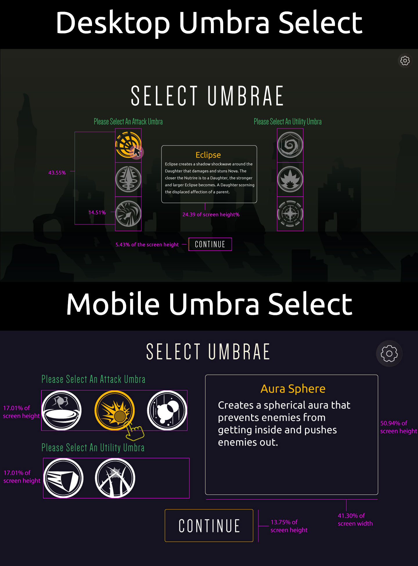
Lightmare was unique in the fact that interface considerations had to be made for both the desktop and the mobile player. Since I had ample experience playing both desktop and mobile games, I worked with my teams UI lead to maintain consistency across both platforms.
User Testing
During the last phases of the project, I would conduct play testing sessions with random players. By documenting their experiences, I was able to collect data that was able to make the project's path forward much more clear by having hard data to guide decisions. It's hard to express just how incredibly useful it was to document user experience and their user journeys.
Overview
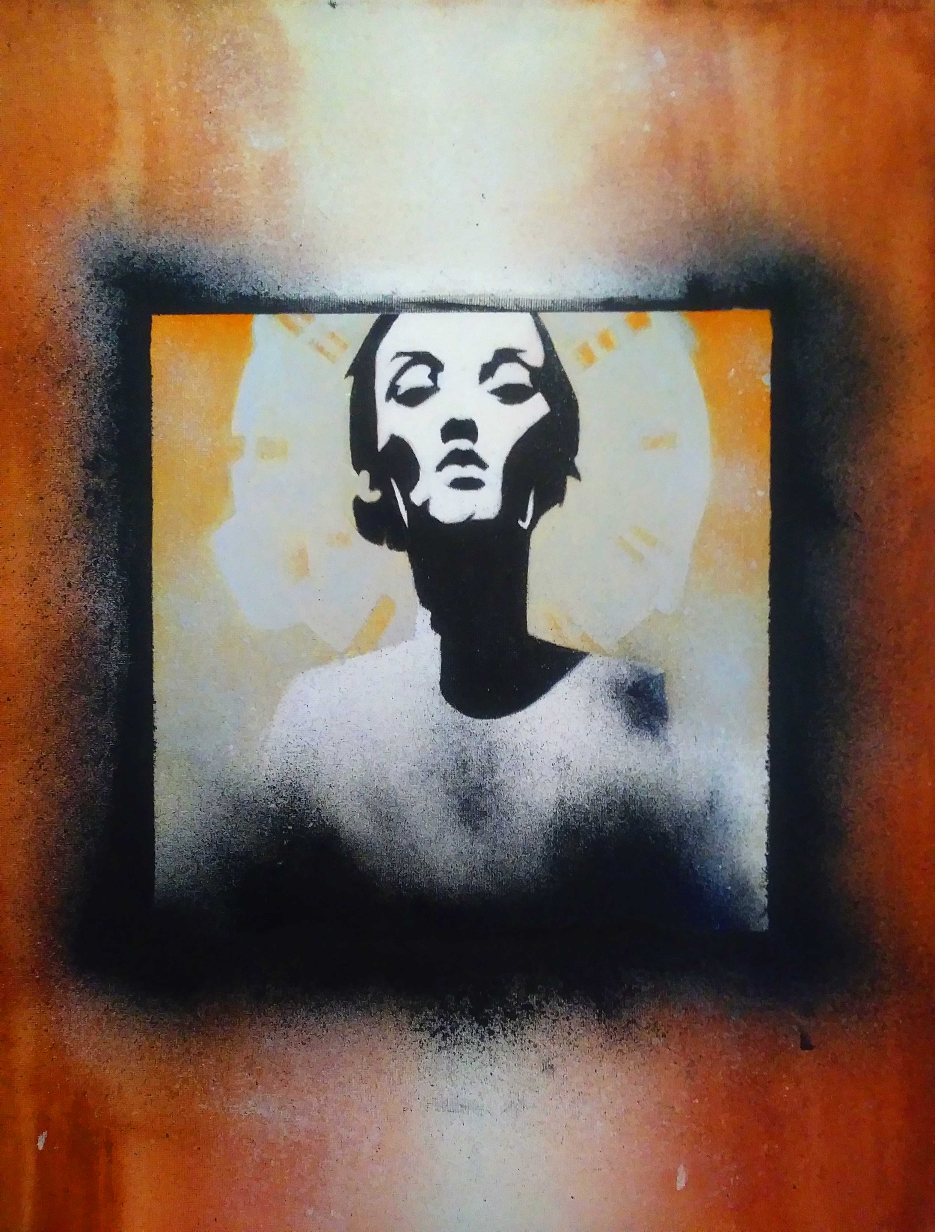
'Jane Doe' was one of the more fun pieces I've done. Not only did it employ techniques I never used before but a lot of the pressue to make it visually appealing was already solved since it was an adapation of the band Converge's 'Jane Doe' album cover art.
Acrylic Wash
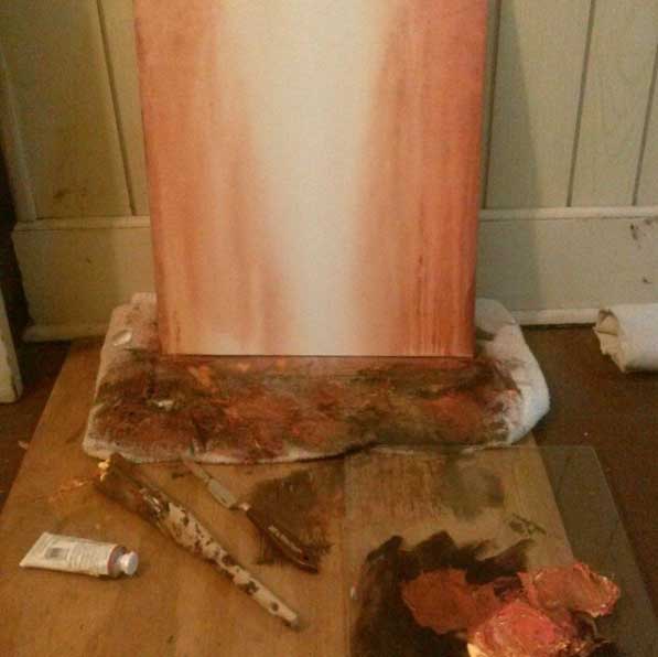
The piece started with an acrylic wash. I layered on acrlyics with a wet brush. While the paint was still wet, I sprayed it down with a Dollar General spray bottle. The more water added, the more diluted the acrlyics became. Hence the white 'column of light' in the background is where I sprayed the most water.
Oil Portrait
Once the wash dried, I painted the Jane Doe oil portrait on top of it. It features an achromatic female figure and a monochromatic ground.
After the oil portrait was done, I then layered a cardboard square of the same size on top it, taped it down, and then splattered black oil paint around the edges. I removed the cardboard and this is what gives the portrait its black 'splatter frame' effect.
To see more of my art, check out my gallery.
Games are ux and art fused into an exquisite, interactive design. Catch me dorking out about them!